4 Signs it’s time to refresh your logo
(3 minute read)
A logo is a vital part of your company’s visual identity, an avatar if you will. A potential client’s first perception of your brand, and your most identifiable asset.
Unfortunately, our experience has shown that many businesses treat their logo as a static one-off design, never to be re-visited. Once designed, often in the early stages of the business, it is then left abandoned.
But, like all aspects of your business your logo can adapt to meet requirements and to keep up with industry standards. There are logos out there that will stand the test of time but even the largest companies in the world make minor adjustments to their logos from time to time.
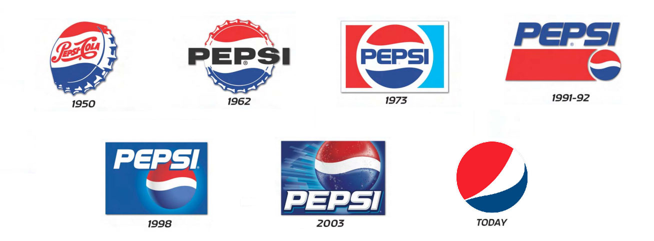
Take a look at the development of the Pepsi logo (above). Pepsi has evolved its visual identity over time to ensure effective communication of the brand in a timeless manner, arguably with an expression of clarity.
These adaptations allow them to maintain consistency and relevance across their marketing materials.
So, how do you know if your logo is ready to be revisited?
1. Outdated design
If your logo was designed 15 years ago chances are it’s starting to look a little old fashioned. And, whilst it may look OK on print it may not work well when placed on your website or social media sites. Having your logo redesigned using up-to-date graphic design software will ensure your logo is easily adaptable for a variety of uses including print and digital media.
2. It doesn’t make any sense
There are A LOT of logos out there that have been created purely because they look nice. These logos tend to have nothing to do with what the business actually does. This can be hugely detrimental for a business when it comes to memorability.
If your logo is confusing and doesn’t represent your company this can indicate a poor understanding of what your business offers. The concept behind your logo needs to come from the concept behind your business and if that is not the case it’s time to revisit your logo design.
3. It doesn’t meet industry standards
If you own a circus or you’re starting up a new, quirky nightclub then a creative, colourful logo is probably the way to go. But, if you’re in a serious profession where your competitors have logos that are all simple and sophisticated try not to deviate too much from the industry norm.
The top brands in your industry have probably paid a lot to have their logos thoroughly thought through so it makes sense to keep what they’ve done in mind. Having a logo that completely defies industry standards could potentially suggest your company doesn’t know what it’s doing. You don’t want your logo to drive business to competitors.
4. It’s not unique
Whilst it’s important that your logo meets industry standards and makes sense to your audience it’s also vital that your logo stands out from the crowd. If your logo is similar to others in your industry and has nothing unique then it’s time to rethink. Originality is key when it comes to branding, logos bought online from a pre-made logo site will not cut it.
If you’re still unsure about the quality of your logo we suggest asking a professional designer to take a look. But if you know that your logo needs a refresh and you’re ready to take the next step, here are a few things to ask yourself before you begin:
What is the core purpose of my business?
Who is my business for?
What are the key elements of my business that need demonstrating?
What are my competitors doing?
Does my logo still represent what my business is about?
Could my logo do with redesigning completely or does it just need refreshing?


