Two Hands: A brand built for learning
BRAND / MARKETING STRATEGY
LOGO DESIGN / VISUAL ID
BRAND GUIDELINES
COPYWRITING
ART DIRECTION + DESIGN
SOCIAL / MARKETING
WEBSITE / PLATFORM DESIGN
“In (hug) I got more than a branding, design and marketing agency. I also gained a business partner and critical friend in the crucial first stages of brand building. I cannot recommend (hug)London more highly. From our initial strategic discussions to define my brand to their work on the brand’s visual identity and website construction, I can honestly say that working with (hug) has been the best business decision I’ve taken so far. Thank you! ★★★★★”
A new preschool in West London that values a love of learning, resilience, kindness, effective communication and a strong sense of self-worth. Two Hands offers high-quality preschool education, with flexible, full-time hours that work for your family.
Two Hands Founder Joanna spent 14 years in secondary education, both as a teacher and as a school leader, because she believes in its power to transform the lives of individuals and society at large. After becoming a parent and starting to return to careers, Joanna and her husband couldn’t find a preschool that offered what they needed, “I wanted the high-quality education and nurturing environment of a preschool, but we also really needed the hours of a nursery to cover a working day, all year round.” So Joanna decided to solve the problem herself. And that’s how Two Hands was born.
Joanna approached us at (hug) to help her build her idea into a brand parents and children would love right from the beginning. The challenge here was communicating how Two Hands was different to other options already available. There is no correct terminology for what Two Hands offers so we needed to make sure the value of the approach was obvious to parents immediately.
our strategy
“Flexibility for your family. Learning for life.”
Two Hands is driven by a belief that a better world starts with a better education at a young age. Their approach to education is grounded in well-known educational philosophies such as Montessori, Froebel and Reggio Emilia. But more importantly, it draws from the latest early years education research.
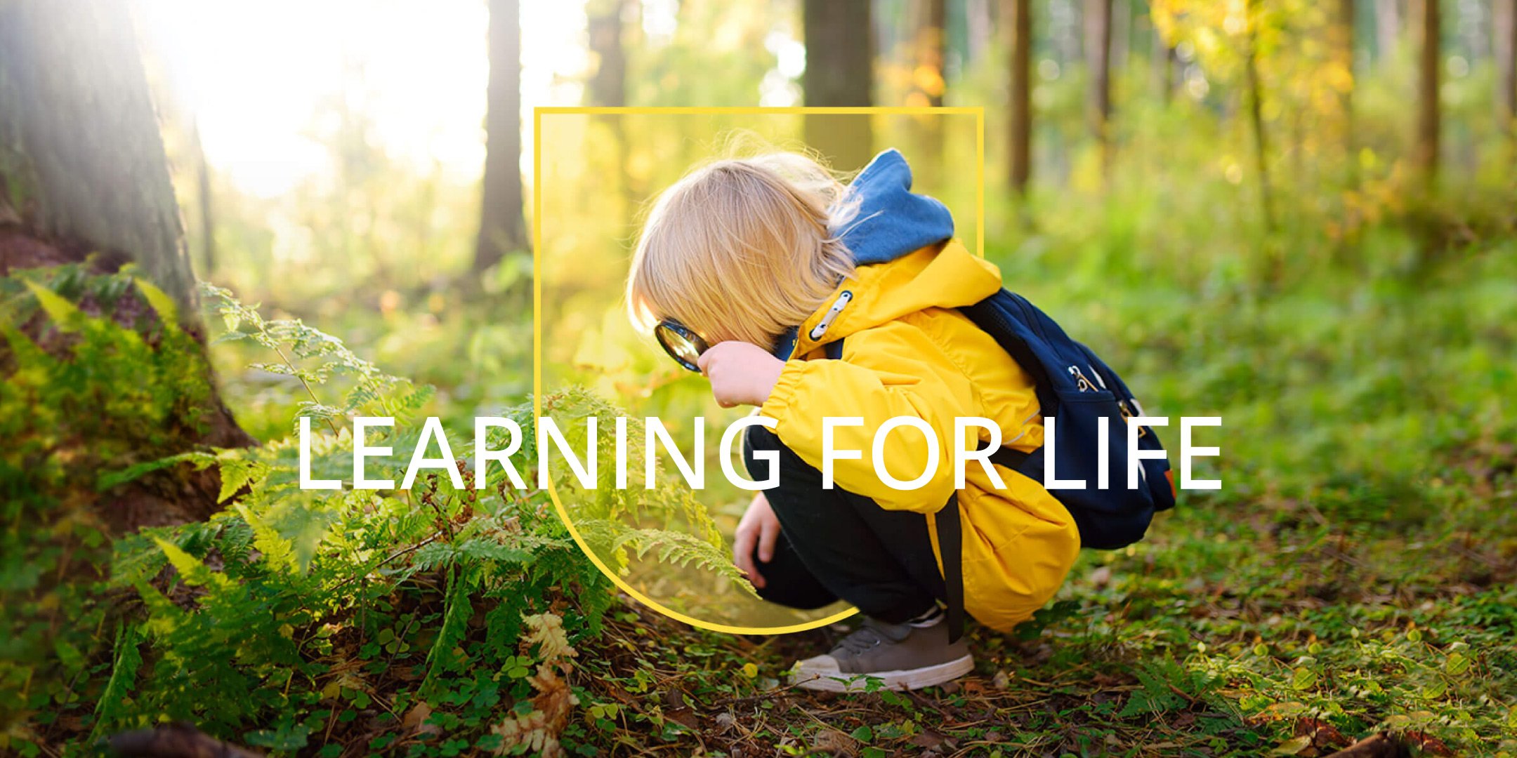
Following a deep dive into the education system, the way we learn and the real skills we all benefit from long-term, we struck upon the idea of ‘learning for life’. It’s not just about learning it’s about helping children become great learners, equipping them with the life skills they’ll need to navigate the world and make it a better place. By building a positive foundation at a young age, Two Hands helps your child become a learner for life.
In addition to the bigger-picture thinking, Two Hands is also unique because of its operational differences. They combine high-quality preschool education with flexible, full-time care hours that work well for working parents. It was critical for Two Hands to highlight their unique operational differences to parents quickly and effectively, but we didn’t want to lose the power of the long-term vision.
art direction
Bright, playful and engaging. The visual identity flowed from Two Hands’ personality and approach to learning. The colour palette is a sophisticated play on the primary colours and the lines were inspired by the hand-drawn outlines of children’s hands. The logo is a nod to the name and provides the school with a modern, timeless badge to be used on stationary, uniforms and marketing materials.


