Settle: Laying the foundations for a happier home search
BRAND NAMING
BRAND / MARKETING STRATEGY
LOGO DESIGN / VISUAL ID
BRAND GUIDELINES
COPYWRITING
ART DIRECTION + DESIGN
SOCIAL / MARKETING
WEBSITE / PLATFORM DESIGN
“The team at (hug) have been amazing. We needed a product to work with and they’ve got us up and running faster than we imagined. We instantly loved the visuals and felt they knew what we wanted from Day 1. Glad we chose to work with them, their input has been important for all our business decisions.”
Meet the people who are on a mission to make buying a home the happy experience it ought to be. Starting in East London Michael and Mirko, founders of Settle, are your neighbourly estate agents. By taking a personal, honest and speedy approach to helping people move, they make finding a place to call home in East London a positive experience.
If you’ve ever experienced moving home, you’ll know the frustrations that come with the process. It can feel like there’s no one on your side, no one telling you the truth and that everyone’s just trying to get the best deal for themselves. Having worked in estate agency for over 10 years between them and helped over 4,000 people find new homes, Michael and Mirko knew the estate agency reputation was due an uplift, so they came together to start their own agency, one that does things differently.
When they came to us, both knew who they wanted to be but needed guidance on how to differentiate themselves. They needed to build a brand their customers could relate to and, most importantly, trust. Michael and Mirko had some initial thinking, and a name, but both needed developing. So, we started with brand, brand name and messaging strategy, helping them identify their core vision as well as how to communicate it.
Having worked in similar industries before, we had comprehensive market knowledge, so they trusted our team and took our advice on other elements of their business too. We had an instant connection with the team and so embarked on a journey to help them lay the foundations for a strong, industry defining brand.
our
strategy
Make moving homes the happy experience it ought to be.
Following multiple conversations with Michael and Mirko, we noticed they didn’t want to be just another estate agent, they genuinely wanted to improve the moving experience for people. With additional research we confirmed the things people find most frustrating about estate agents are the lack of taking responsibility and the lack of communication during the moving process. Solving these problems is at the core of the Settle brand and that’s how we landed on ‘making moves homes a happy experience’.
Once we had a clear direction, the current name ‘Sculpt Homes’ didn’t feel right and didn’t reflect their personality or have much to do with the industry they’re in. Following discussions, we settled on Settle, a name that positions Michael and Mirko as nurturing while also cementing their joint vision that everyone should have a place to call home, a place to feel settled.
finding the
right tone
The critical thing to get across was the neighbourly touch and positive attitude of Settle. We helped the brand speak in a helpful and friendly way that makes their clients feel comfortable, knowing they're in safe hands. An essential part of their tone of voice is the consistently upbeat attitude and cheerful turn of phrase — something the industry generally lacks. Michael and Mirko were keen to help their clients understand the process without making them feel overwhelmed, and so Settle remains pragmatic and speaks from experience, using their expertise without the jargon and cliché phrases. This tone of voice is crucial for making moving the happy experience it ought to be.
visual
identity
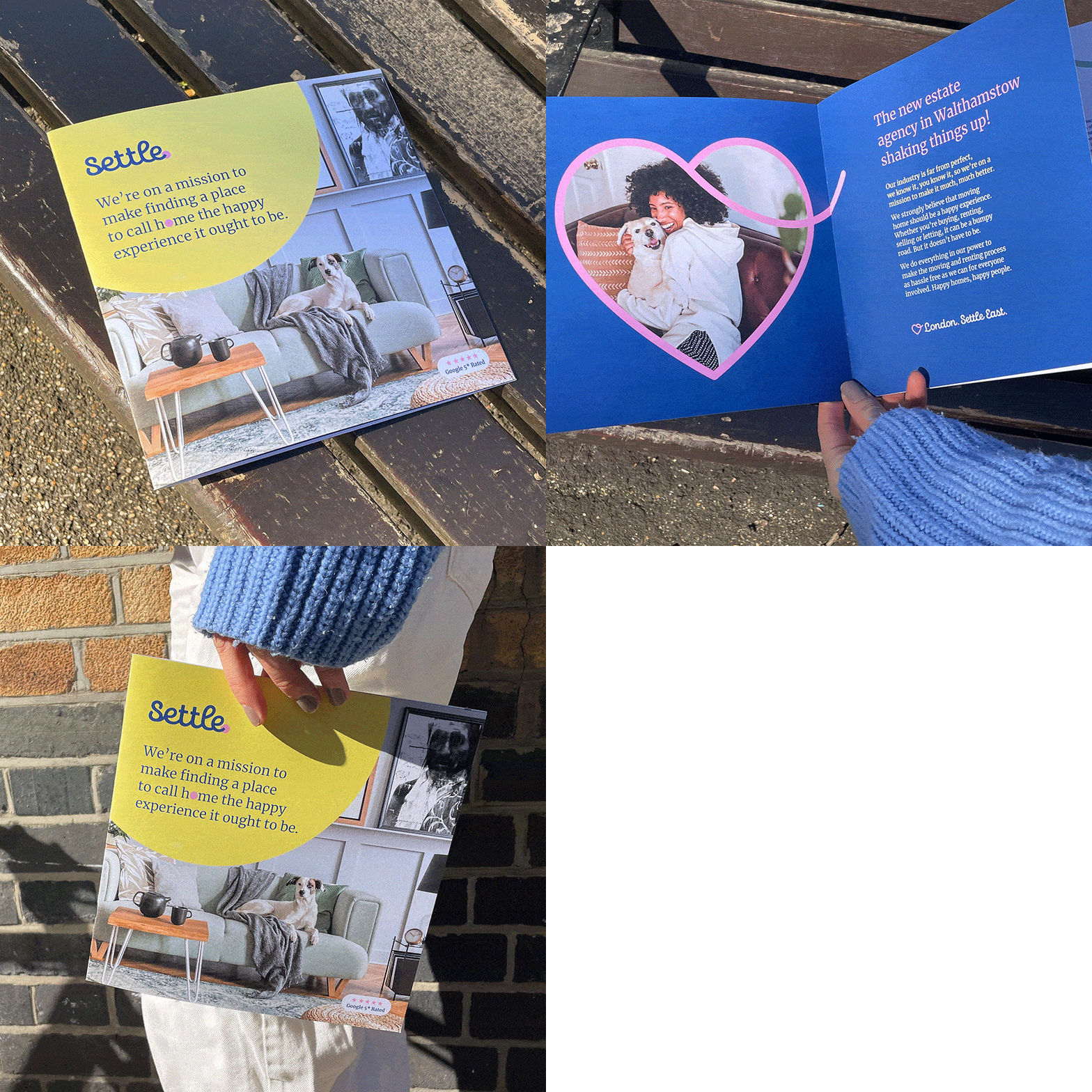
Once their brand personality was defined and we had good understanding of their target market, we started work on their visual identity. Avoiding all the common traits of a frankly tired industry we took inspiration from some of the modern brands people love right now, including Airbnb and Loaf. The identity needed to showcase Settle as a fresh, new local estate agent whose door is always open — bright, energetic and full of positivity. Achieving the look and feel we eventually settled on was a collaborative and iterative process. The logo started out as a simple typographic wordmark but was then crafted into the final version you see now with the ‘.’ at the end adding a nod to the ‘location’ aspect of their brand. Finding a new home is an emotional experience, so the continuous line and dot in the Settle logo represent the journey that a potential buyer or renter goes on to eventually end up with their dream property. The heart epitomises Mike and Mirko's love for East London, property and their customers.
This was a starting identity for Settle and they wanted to move quickly, so we didn’t have months to explore complicated visual worlds and quite frankly they didn’t need it. So, we took a slightly different approach and used the unique elements we’d created in the logo to craft an extended visual identity that could be used elsewhere without becoming too repetitive. We cropped into the heart and used the dot to create complementing graphic elements and assigned certain colours of their palette to particular messages.
Photography wise we used a combination of stock and bespoke photography, first defining the look and feel of the imagery before art directing the portraits they needed.
From there, everything from their Facebook banners to the entire website told their story visually. We showcased visual brand elements, including typography, messaging, colour, iconography and the heart and circle (those iconic shapes set out in their logo).


